GOAL
Increase the application rate by 10%. Break through any bottlenecks that are throttling traffic to the Savings & CD application.
The business stakeholders approached the design team with a request to increase the completion rate of the CDs and Savings application by 10%. Due to a failed prior redesign, the completion rate had fallen significantly. My UX team was tasked with understanding what had gone wrong and how we could fix it in order to secure those 12,000+ accounts we were losing on a monthly basis.

I conducted a competitive analysis between Barclays and five direct and indirect competitors. I analyzed the flows from American Express, Discover, Marcus by Goldman Sachs, Capital One, and Chase. Some illuminating findings from my research were:
Barclays is one of few institutions that allows the user to sign up for a CD and a Savings account in the same flow.
Barclays’ application lacks a progress indicator, and the old form largely ignored many UX principles.
Companies that placed a higher value on not only making the experience more delightful, but also accessible and human-centric, ultimately had the best performing application (Capital One and Marcus).
There were several parameters that made this challenge interesting:
Barclays is traditionally a conservative institution. The application was lengthy, and included forms that I believed to be unnecessary. The form fields needed to remain per legal standards.
These application changes needed to be designed quickly, so as to be developed by the savings season in January and February.
We worked with a 3rd party vendor to host the application, so many changes could not be too drastic.
The brand standards are divided between the current US standards, the UK standards, and the future unified brand standards.
The Focus
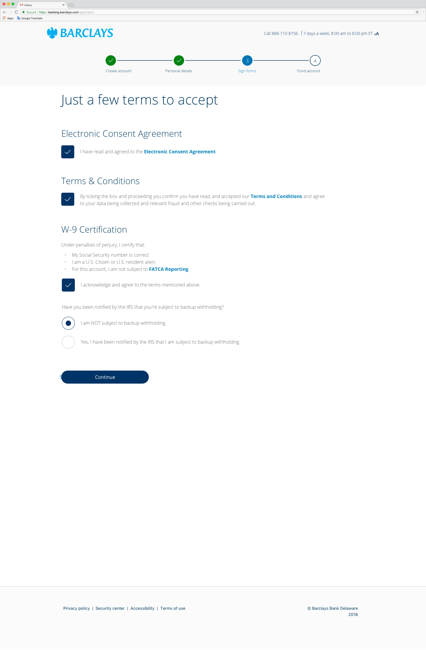
What stood out to me about our form was how complex the Terms and Conditions portion of the application was. Indeed, it was the area where our users had the largest drop-off: about 15%-20%! I felt that if my priority for this assignment was “biggest bang for the buck”, I needed to focus on the largest “wins” first and then get more granular if there was time, because of how limited the timeline was for this project.
Another goal was to improve on the aesthetics and the UI of the form, by making the form feel less constricted, which also better aligned with the recent Barclays rebrand.
Lastly, my focus was on offering more affordances to the user. The form in its current state is one that lacks any valuable indications if a user is filling out the form fields correctly, or whether there is any sort of error that will drive the user away if he/she cannot fix it.
The Result


The pages now are designed with floating labels to give more context and without borders in order to preserve the open feeling.
The Terms and Conditions page is now reduced to short, quick check-boxes that a user has to click if he/she agrees. If the user wishes to read more, a new tab opens with all the appropriate information.
I also introduced elements that were completely new to Barclays, in order to help the user understand the rules better. The check-boxes would light up when the user satisfied the password requirements, alerting them that they have made a great password!
I wanted to guide the user to complete the form in a quick, and friction-less manner, by adding small indicators of success along the way. If the experience feels fresh and almost gamified, the user will have an easier time forgetting that they’re completing a (potentially dull) banking application.
WHAT I LEARNED
Through this process (which still has miles to go), a key learning experience for me was managing my design work to fit within the needs and timelines of other business stakeholders. I learned that with many hands in the cookie jar, the designer has to set parameters for herself as well, and push back when the laws of UX design contradict the “feelings” or “fears” that may instruct the business and legal decisions. In order to move forward, an organization must stay nimble, and strong partnership between designers and other business stakeholders is a key element of achieving that goal.